Introduction to Decision Theory: Part III
Table of Contents
Closing the Loop
In Part I, we explored the oil company’s dilemma: should we buy the field or walk away? We used a decision tree to analyze the problem step by step, weighing probabilities and payoffs to determine the optimal choice. In Part II, we examined the limitations of decision trees and introduced influence diagrams as a more scalable alternative. We solved the same problem manually using influence diagrams, confirming that they yield the same result as decision trees.
But let’s be honest, constantly redrawing diagrams and recalculating expected utilities every time geological estimates change or market conditions shift is not realistic. Real-world decision problems need tools that adapt quickly. That’s what we’ll build in this final part, focusing on two crucial questions:
-
How do we actually implement these models in code? We’ll see how to recreate our oil field analysis using
PyAgrum, transforming those tedious manual calculations into just a few lines of Python. -
How much should we trust the model’s recommendation? Using sensitivity analysis, we’ll discover whether our “buy the field” decision is robust to parameter changes. We’ll build different types of visualizations and create an interactive
Gradiointerface where we can adjust any parameter and immediately see the impact.
Building the Oil-Field LIMID in PyAgrum
PyAgrum is a Python wrapper around the C++ aGrUM library for building and solving probabilistic graphical models such as Bayesian networks, LIMIDs, causal networks, and more. With a few lines of Python code we can define the influence diagram’s structure, add the probabilities and utilities, execute, and get the optimal policy.
Let’s now code the decision problem.
Setting Up the LIMID Structure
We start by importing pyagrum and creating an empty influence diagram. Then we add our four variables: oil field quality (\(\textcolor{purple}{Q}\)), test results (\(\textcolor{purple}{R}\)), the test decision (\(\textcolor{red}{T}\)), the buy decision (\(\textcolor{red}{B}\)), and a utility node (\(\textcolor{blue}{U}\)).
import pyagrum as grum
from pyagrum import InfluenceDiagram

# Create the influence diagram
influence_diagram = InfluenceDiagram()

# Initialize with 0 states, then manually add the labels we need
Q = influence_diagram.addChanceNode(
    grum.LabelizedVariable("Q", "Q", 0).addLabel('high').addLabel('medium').addLabel('low'))
R = influence_diagram.addChanceNode(
    grum.LabelizedVariable("R", "R", 0).addLabel('pass').addLabel('fail').addLabel('no_results'))
T = influence_diagram.addDecisionNode(
    grum.LabelizedVariable("T", "T", 0).addLabel('do').addLabel('not_do'))
B = influence_diagram.addDecisionNode(
    grum.LabelizedVariable("B", "B", 0).addLabel('buy').addLabel('not_buy'))
U = influence_diagram.addUtilityNode("U")  # Utility node takes just a name
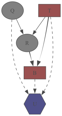
Next, we connect the nodes with arcs to capture the dependencies from our diagram. Notice the memory arc from \(\textcolor{red}{T}\) to \(\textcolor{red}{B}\) that transforms the diagram into a LIMID.
# Add arcs to define dependencies
influence_diagram.addArc("T", "R")
influence_diagram.addArc("T", "B")    # Memory arc: buy decision remembers test choice
influence_diagram.addArc("T", "U")
influence_diagram.addArc("R", "B")
influence_diagram.addArc("B", "U")
influence_diagram.addArc("Q", "R")
influence_diagram.addArc("Q", "U")
PyAgrum makes it easy to visualize what we’ve built. We can generate a diagram directly from our code:
import pyagrum.lib.notebook as gnb
from pyagrum.lib import image

# Display if run in Jupyter notebook
gnb.sideBySide(influence_diagram, captions=["Oil field influence diagram"])

# Or export to PNG for use elsewhere
image.export(influence_diagram, "influence_diagram.png")
Here’s the resulting influence_diagram.png, the same LIMID from Part II.
|
|
| Figure 1. Visual representation of the oil field LIMID generated by PyAgrum | |
Filling in the Numbers
The network structure is just the skeleton. Now we need to populate it with the probabilities and utilities from our original problem.
First, we set the prior probabilities for oil field quality:
influence_diagram.cpt(Q)[:] = [0.35, 0.45, 0.2] # high, medium, low
Next, we define how test results depend on both the true field quality and whether we actually perform the test:
# When test is performed ('do')
influence_diagram.cpt(R)[{"Q": "high", "T": "do"}] = [0.95, 0.05, 0.0]    # pass, fail, no_results
influence_diagram.cpt(R)[{"Q": "medium", "T": "do"}] = [0.7, 0.3, 0.0]
influence_diagram.cpt(R)[{"Q": "low", "T": "do"}] = [0.15, 0.85, 0.0]

# When test is not performed ('not_do') - always get 'no_results'
influence_diagram.cpt(R)[{"Q": "high", "T": "not_do"}] = [0.0, 0.0, 1.0]
influence_diagram.cpt(R)[{"Q": "medium", "T": "not_do"}] = [0.0, 0.0, 1.0]
influence_diagram.cpt(R)[{"Q": "low", "T": "not_do"}] = [0.0, 0.0, 1.0]
Finally, we specify the utility values for each combination of decisions and outcomes. Note the $30M test cost when we choose to perform the test:
import numpy as np

# Test performed: subtract $30M test cost from original values
influence_diagram.utility(U)[{"T": "do", "B": "buy"}] = np.array([1220, 600, -30])[:, np.newaxis]    # Q: high, medium, low
influence_diagram.utility(U)[{"T": "do", "B": "not_buy"}] = np.array([320, 320, 320])[:, np.newaxis]

# No test performed: original values
influence_diagram.utility(U)[{"T": "not_do", "B": "buy"}] = np.array([1250, 630, 0])[:, np.newaxis]
influence_diagram.utility(U)[{"T": "not_do", "B": "not_buy"}] = np.array([350, 350, 350])[:, np.newaxis]
[:, np.newaxis] reshaping is used to align the data with the expected order of parent nodes. While not confirmed to be a universal PyAgrum requirement, this approach proved effective in this specific implementation.
Solving the Network
With structure and parameters in place, we can create an inference engine and solve the decision problem. In this case, we use the Shafer-Shenoy algorithm for LIMIDs (Shafer & Shenoy, 1990):
# Create inference engine and solve
inference_engine = grum.ShaferShenoyLIMIDInference(influence_diagram)
inference_engine.makeInference()

print(f"Is the diagram solvable?: {inference_engine.isSolvable()}")
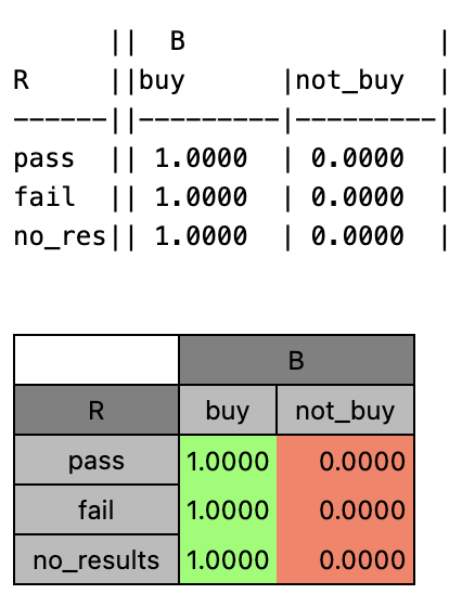
We can examine the optimal decision for each decision node. For example, the test decision (\(\textcolor{red}{T}\)):
from IPython.display import display

optimal_decision_T = inference_engine.optimalDecision(T)

print(optimal_decision_T)
display(optimal_decision_T)
This outputs both a text representation and a formatted table in Jupyter notebooks:
|
|
| Figure 2. Optimal decision for test variable T shown in both text and table format | |
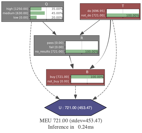
We can also generate a visual representation of the solved network, showing the optimal decisions and expected utilities:
# Note: On macOS, you may need this line to avoid cairo issues
import os
import pyagrum.lib.notebook as gnb

os.environ["DYLD_FALLBACK_LIBRARY_PATH"] = "/opt/homebrew/opt/cairo/lib"

# Visualize the solved network
gnb.showInference(influence_diagram, engine=inference_engine, size="6!")

# Or export the inference result as an image
image.exportInference(influence_diagram, "inference_result.png", engine=inference_engine)
|
|
| Figure 3. Solved oil field LIMID showing optimal decisions and expected utilities | |
The results confirm our hand-written calculations: the optimal strategy is to skip the test and buy the field directly, with a maximum expected utility of 721 million dollars. What took us pages of manual calculations, PyAgrum solved in just 0.24 milliseconds.
Testing Robustness with Sensitivity Analysis
Now that we’ve found the best strategy for buying the oil field, we may wonder: What happens if we got some of our numbers wrong? Maybe the geological survey isn’t as accurate as we thought, or test costs could jump higher than expected. At what point do these changes actually matter for our decision?
This is exactly what sensitivity analysis helps us figure out. Once we have our optimal strategy, we need to test how much our answer depends on the specific numbers we plugged in. Some parameters might barely affect our decision, while others could completely flip our recommendation with just small changes.
We’ll tackle this challenge with three complementary approaches:
-
Single-parameter sweeps: Vary one parameter at a time to see how the expected utility changes, helping us understand individual parameter sensitivity.
-
Tornado diagrams: Create visual summaries that show which variables have the most impact on our decision, sorted by magnitude of influence.
-
Interactive Gradio interface: Build a web app where we can change multiple parameters simultaneously, and instantly see how the optimal decision and expected utility respond.
Single Parameter Sensitivity Analysis
Single parameter sensitivity analysis examines how changes in one specific parameter affect the optimal decision and expected utility while keeping all other parameters constant. This approach is particularly valuable because it:
- Identifies critical thresholds: We can discover specific values where the optimal decision changes.
- Guides data collection: Parameters with high sensitivity may warrant additional research or more precise estimation.
Let’s apply this to two key parameters in our oil field problem.
Example 1: Prior Probability of High-quality Fields
Our first analysis explores how varying the prior probability that a field is high quality influences our decision strategy. Beginning with the baseline value \(P(\textcolor{purple}{Q}=\textcolor{purple}{\text{high}}) = 0.35\), we adjust this probability by \(\pm0.15\) in increments of \(0.05\), producing seven scenarios. The probabilities of the remaining quality categories are rescaled proportionally so that the distribution still sums to one.
| Figure 4. Sensitivity analysis of prior probability P(Q=high) showing the relationship between field quality expectations and maximum expected utility |
These changes definitely affect how much money we expect to make, but they don’t change the optimal policy: skip the test and buy the field directly. This makes sense when you think about it: knowing that fields in this region are more likely to be high quality affects our expected profits, but it doesn’t change how useful the test would be.
Example 2: Test Precision for Medium-quality Fields
For our second analysis, let’s look at the geological test’s accuracy, specifically focusing on its ability to correctly identify medium-quality fields. Medium-quality fields are particularly interesting because they are profitable but seem easy to mistake for low-grade ones.
What if we could improve the test to better identify these medium-quality fields? We’ll vary the test’s pass rate for true medium fields \(P(\textcolor{purple}{R}=\textcolor{purple}{\text{pass}} \mid \textcolor{purple}{Q}=\textcolor{purple}{\text{medium}})\) from \(0.70\) to \(0.95\) to see when the improved accuracy makes testing worthwhile.
| Figure 5. Sensitivity analysis of test precision P(R=pass | Q=medium) showing when improved test accuracy makes testing worthwhile |
Interestingly, once the test becomes good enough at spotting medium-quality fields (achieving \(0.9\) accuracy or better), testing suddenly becomes worth the cost. The takeaway is clear: if we can upgrade our testing technology to correctly identify medium-quality fields at least 90% of the time, we should start using the test before making purchase decisions.
Tornado Diagrams: Visualizing Parameter Impact
While single parameter analysis tells us how each variable affects our decision, tornado diagrams give us the big picture by ranking all parameters by their individual impact. These charts get their name from their shape: wide at the top for the most important variables and narrow at the bottom for the least important.
These diagrams are particularly valuable when we have formulas that define the utilities. For instance, if our utility numbers depended on a formula based on factors like drilling costs, oil prices, or project timelines, a tornado diagram would easily show us whether a 10% change in oil prices matters more than a 20% change in drilling costs.
For our oil field problem, we’ll look at two examples to see how this works.
Example 1: Direct Utility Value Sensitivity
Our first tornado analysis examines how changes in the direct utility values affect the maximum expected utility. We test each utility parameter by applying a \(\pm100\) million dollar variation while keeping all other parameters constant.
| Figure 6. Tornado diagram showing the impact of utility value variations on maximum expected utility |
The analysis reveals that \(\textcolor{blue}{U}(\textcolor{red}{T} = \textcolor{red}{\text{not_do}},\ \textcolor{red}{B} = \textcolor{red}{\text{buy}},\ \textcolor{purple}{Q} = \textcolor{purple}{\text{medium}})\) has the largest impact on our decision. This makes intuitive sense, since medium-quality fields have the highest prior probability (\(0.45\)), so changes to their utility values disproportionately affect the overall expected utility.
Changes to utilities involving testing (\(\textcolor{red}{T} = \textcolor{red}{\text{do}}\) scenarios) have smaller impacts because testing is already suboptimal in our baseline analysis. These utility values would need to change enough to flip the optimal strategy from \(\textcolor{red}{\text{not_do}}\) to \(\textcolor{red}{\text{do}}\) before they could significantly affect the final result.
However, it’s worth noting that while tornado diagrams can technically be applied to any parameter, they’re most meaningful when applied to underlying variables that feed into the model through formulas rather than direct utility assignments.
Example 2: Test Cost Sensitivity
Our second tornado analysis examines how changes in test cost affect the maximum expected utility. This variable would realistically vary based on market conditions, technology improvements, or operational factors. We evaluate the test cost parameter by applying a \(\pm25\) million dollar variation while keeping all other parameters constant.
| Figure 7. Tornado diagram showing the impact of test cost variations on maximum expected utility |
The diagram shows that test cost has a limited impact on our decision strategy. Even with a substantial 83% cost reduction (from $30M to $5M), the optimal strategy remains virtually unchanged: the MEU increases from 721 million (not testing) to only 721.95 million (testing when it costs $5M), representing a marginal 0.13% improvement.
This suggests that cost reduction alone is insufficient to make testing attractive. To meaningfully shift our strategy toward testing, we would likely need either significant improvements in test reliability (as demonstrated in Example 2 of the single-parameter analysis) or a combination of cost reduction paired with enhanced test accuracy.
Interactive Gradio Interface
Gradio is an open-source Python library that lets you turn any machine-learning model, API, or plain Python function into a shareable web app in minutes. With its built-in hosting and share links, you can demo your project without writing a single line of JavaScript, CSS, or backend code.
|
|
| Figure 8. Gradio example for image generation | |
Although Gradio first became popular for showcasing large-language-model and image-generation demos on Hugging Face Spaces, its simplicity is just as useful here. We’ll use the same drag-and-drop interface to create an interactive decision-analysis tool, proving that Gradio’s convenience extends well beyond mainstream ML examples.
Single-parameter analyses and tornado diagrams show how each variable influences the model on its own. Real decisions, however, often involve several factors moving at once. To explore those multi-parameter scenarios, we can pair PyAgrum’s visualisation tools (see Figure 3) with Gradio’s simple web-app builder to create an interactive playground.
An interactive app brings two key advantages:
- Real-time exploration: Adjust several parameters at once and immediately see how the optimal decision and expected utility change.
- No technical hurdles: Executives and domain experts can experiment freely without touching the underlying PyAgrum code.
Implementation Overview
I have built a Gradio app with three editable input tables: \(\textcolor{purple}{Q}\), \(\textcolor{purple}{R}\) and \(\textcolor{blue}{U}\). It then returns:
- Visual influence diagram with the optimal decision and MEU
- Decision summary providing clear, natural language recommendations
Here’s the high-level structure of the code:
import gradio as gr
import pyagrum as gum
import pandas as pd

q_cpt = pd.DataFrame({
    "Q": ["high", "medium", "low"],
    "Probability": [0.35, 0.45, 0.2]
})

r_cpt  = pd.DataFrame(
  ...
)

u_table = pd.DataFrame(
  ...
)

def analyze_decision(q_probabilities, r_probabilities, utilities):
    # Create influence diagram with user parameters
    influence_diagram = create_influence_diagram(q_probabilities, r_probabilities, utilities)

    # Solve using PyAgrum inference engine
    inference_engine = gum.ShaferShenoyLIMIDInference(influence_diagram)
    inference_engine.makeInference()

    # Generate visualization and recommendations
    diagram_image = generate_diagram_visualization(influence_diagram, inference_engine)
    decision_summary = generate_policy_summary(influence_diagram, inference_engine)

    return diagram_image, decision_summary

# Create Gradio interface with interactive components
with gr.Blocks() as demo:
    # Input components for probabilities and utilities
    q_input = gr.Dataframe(label="Oil Field Quality Probabilities")
    r_input = gr.Dataframe(label="Test Result Probabilities")
    u_input = gr.Dataframe(label="Utility Values")

    # Output components
    diagram_output = gr.Image(label="Influence Diagram")
    summary_output = gr.Textbox(label="Decision Recommendations")

    # Connect inputs to analysis function
    calculate_btn = gr.Button("Calculate Optimal Decision")
    calculate_btn.click(analyze_decision,
                       inputs=[q_input, r_input, u_input],
                       outputs=[diagram_output, summary_output])

demo.launch(share=True)
Demo
I have deployed the Gradio application using Hugging Face spaces. Try adjusting different parameters to see how they affect the optimal strategy and expected utility:
Conclusion
This post concludes our introductory series on decision theory. We’ve explored everything from manual decision trees to programmatic influence diagrams, demonstrating how PyAgrum can solve real-world problems in milliseconds. More importantly, we’ve shown how sensitivity analysis helps us test whether our decisions are truly robust.
We covered three key approaches: single-parameter analysis, tornado diagrams, and Gradio interfaces, each serving a unique purpose. Through these methods, we uncovered an important insight: while changing parameters often affects expected utilities, it doesn’t always change the optimal decision. Recognizing the difference between sensitivity in outcomes and sensitivity in decisions is crucial for practical decision-making.
Looking ahead, I’m optimistic about integrating Large Language Models (LLMs) with influence diagrams to enhance decision-making. Here’s how this could unfold:
-
Short-term goal: Combine LLMs with predefined influence diagrams to improve decision quality, helping generate more rational and data-driven choices.
-
Long-term goal: Enable LLMs to automatically build decision models from natural language descriptions, generate sensitivity analysis code, and highlight the most critical parameters based on domain expertise.
We’ll dive deeper into these possibilities in a future post, so stay tuned!
References
- Rodriguez, F. (2025, June 8). Introduction to decision theory: Part I.
- Rodriguez, F. (2025, July 4). Introduction to decision theory: Part II.
- Shafer, G., & Shenoy, P. P. (1990). Probability Propagation. Annals of Mathematics and Artificial Intelligence, 2, 327-352.
- Wikipedia article on tornado diagrams.
- Hugging Face documentation page on spaces.